Campus Wayfinding Carleton University
The wayfinding experience at CarletonU is currently very poorly designed. A large campus with thousands of students, many struggle initially to find classrooms with some still taking inefficient routes to get from one location to another. With a lack of digital way-finding inside buildings and accessible routes for physically impaired individuals, there is a need for a redesigned platform.
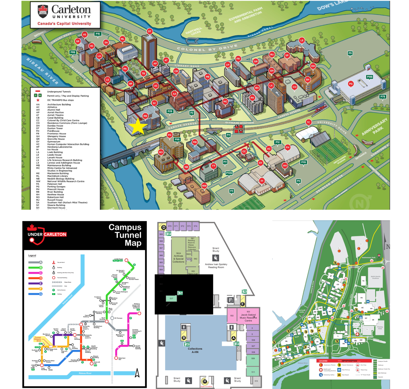
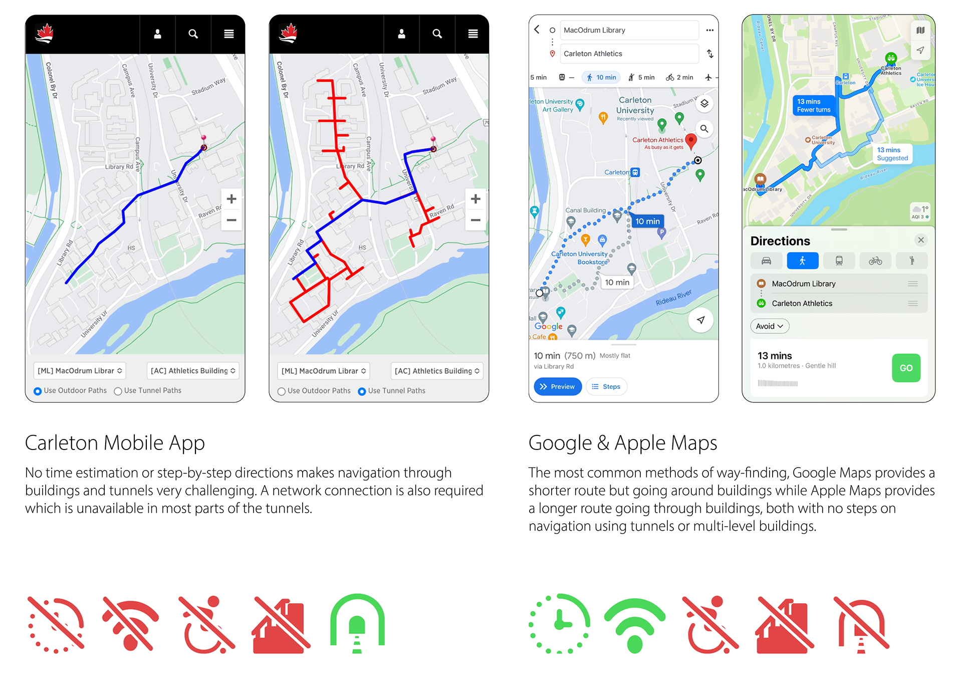
Inconsistent Physical Maps
Icons, typography, and layout is different with each map. Although detailed, these maps fail to work together to provide a unified way-finding experience, resulting in people shifting through multiple different maps to navigate through building interiors, tunnels, and outside paths.
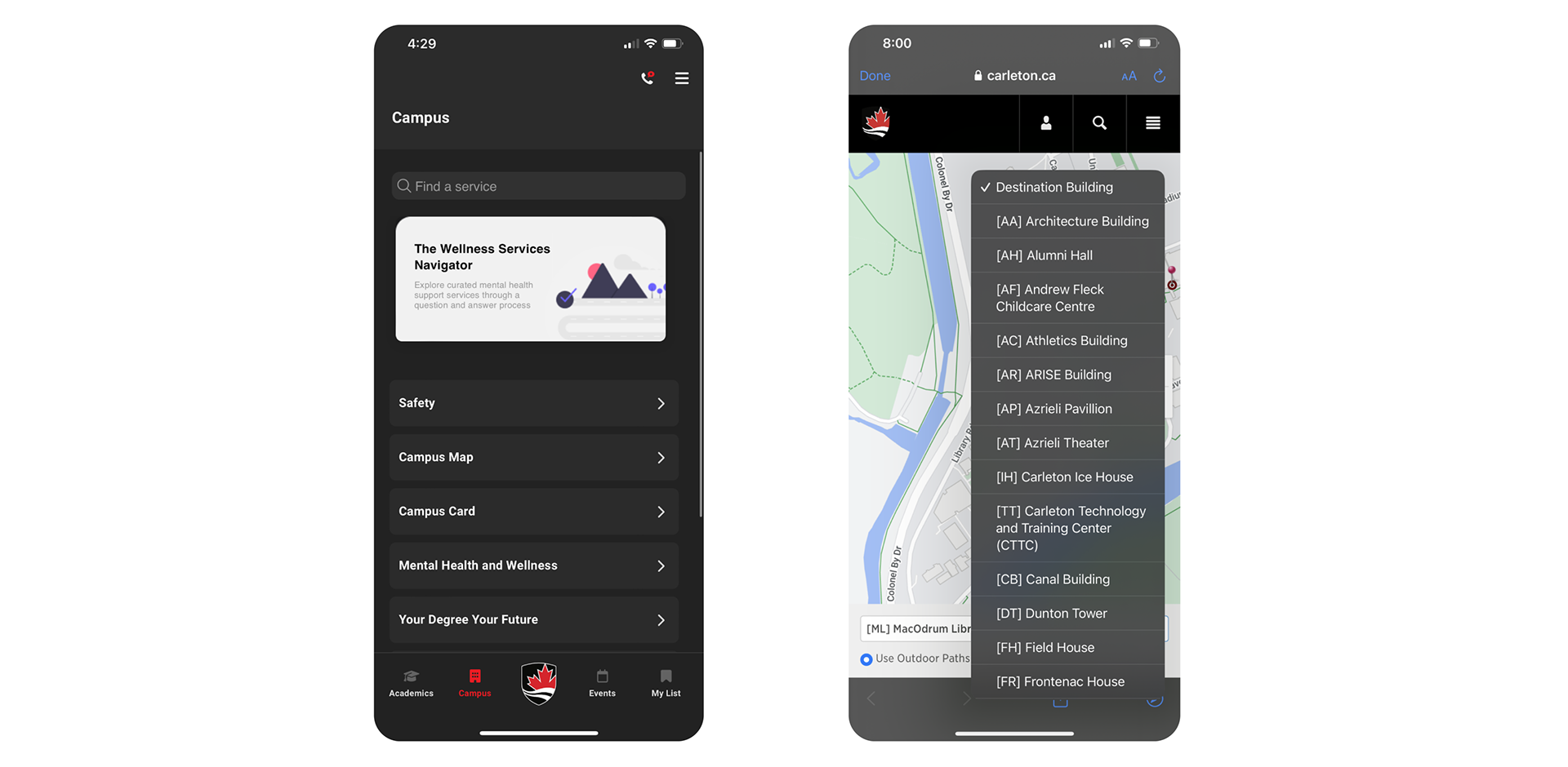
Bare-bones Digital Map
An essential feature is buried away within sub-menus of the app, with the map being opened in the in-app browser. A simple list of buildings as the to/from locations fails to provide needed features of a way-finding app or implement details already available on physical maps.
There is a lack of data for redesigning an efficient wayfinding system specific to CarletonU.
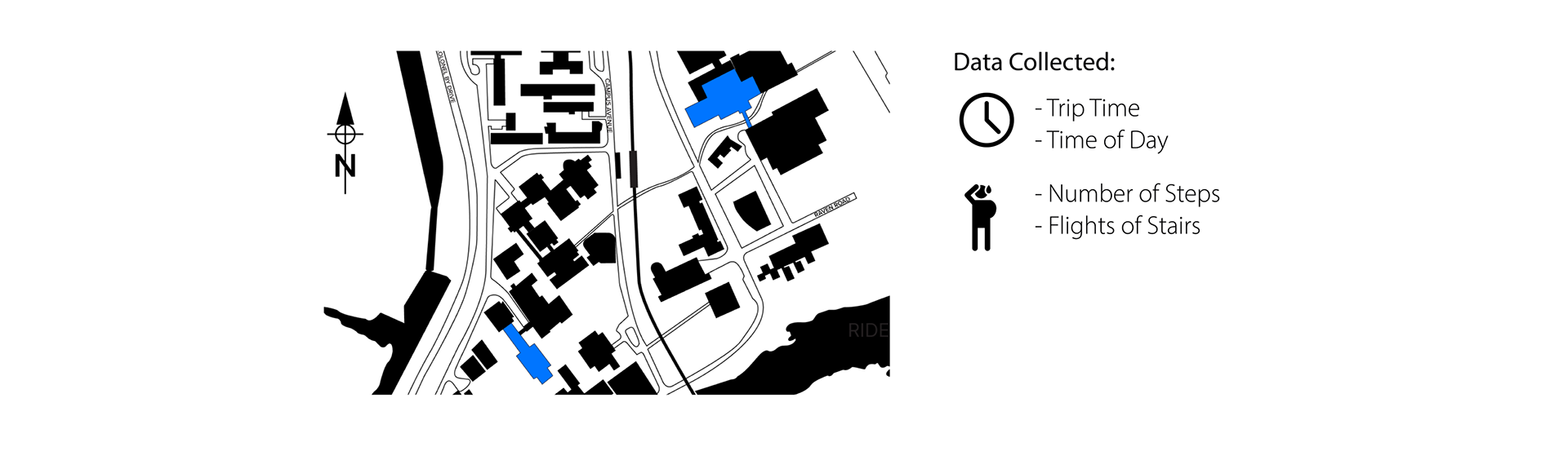
Collecting Quantitative Data Through User Testing Trials
Tracking the path people take from a specific area on campus to another through using the most common wayfinding methods.
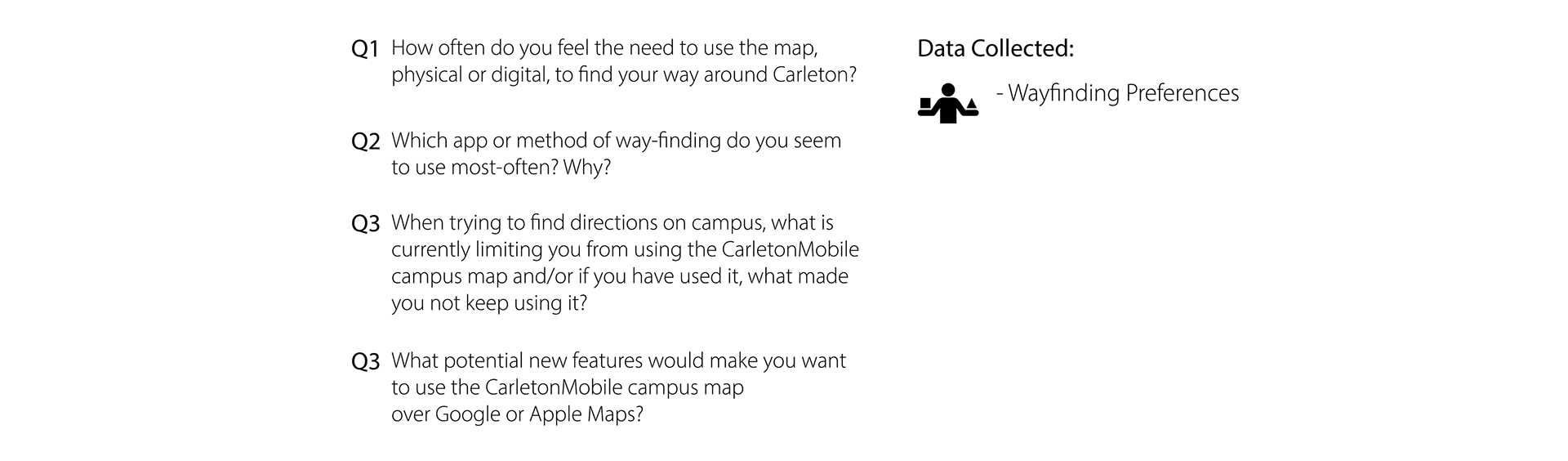
Collecting Qualitative Data Through Interviews
Asking people questions in regards to their current wayfinding experiences and pain points they have or new things they would like to see be implemented.
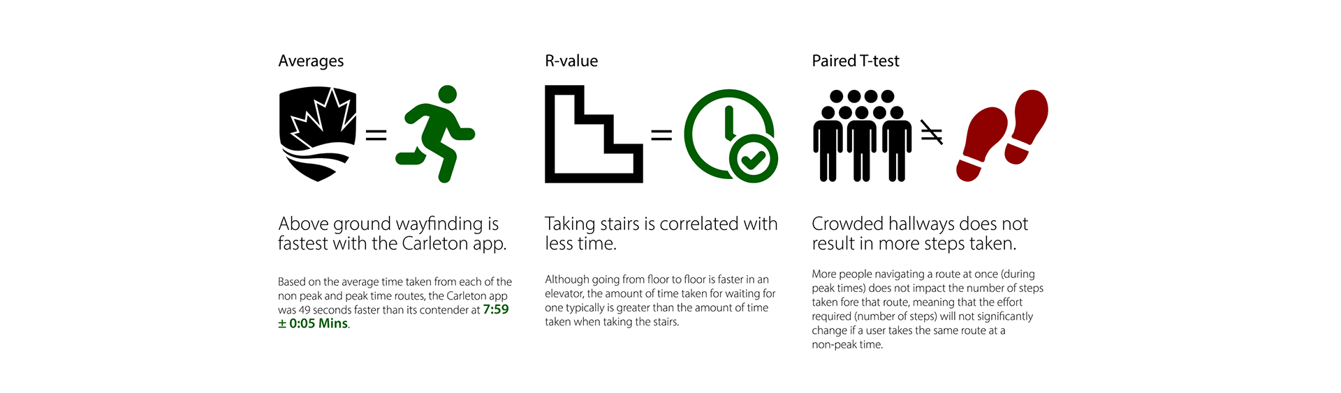
User Testing Route: 4th Floor Library to Athletics South Entrance
A mix of using stairs, walking through different buildings and hallways, the 4th-floor elevator of the campus library to the main entrance of the athletics building are used for determining route efficiency and accessibility concerns through
different routes.
different routes.
4 Trials /Route during Peak & Non-Peak Hours
A total of 20 trials were conducted, each with a different student who did not know the route. 2 trials for each route were conducted at 11:00 AM (10 total for non-peak hours), and then 2 trials for each route were conducted again at 11:30 AM (10 total for peak hours) when lunch starts. This was done to compare the data of crowded and empty routes.
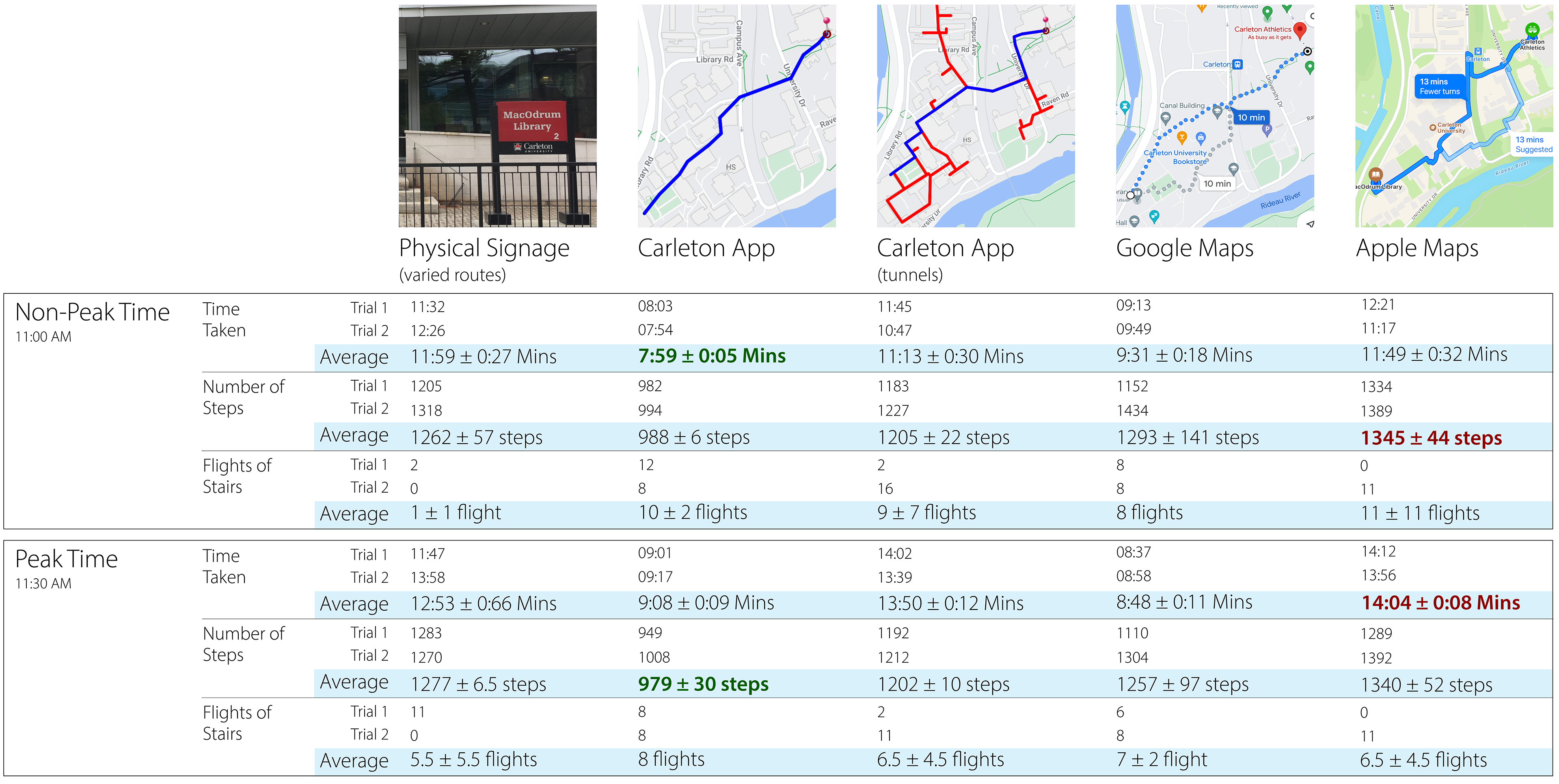
Quantitative Data Analysis: Determining Key Findings from Route Data Sets
Qualitative Data Analysis: Using Content Analysis to Group Interview Responses Into Categories
Turning qualitative responses into quantitative data by determining their importance amongst the Carleton University population through a response ratio.
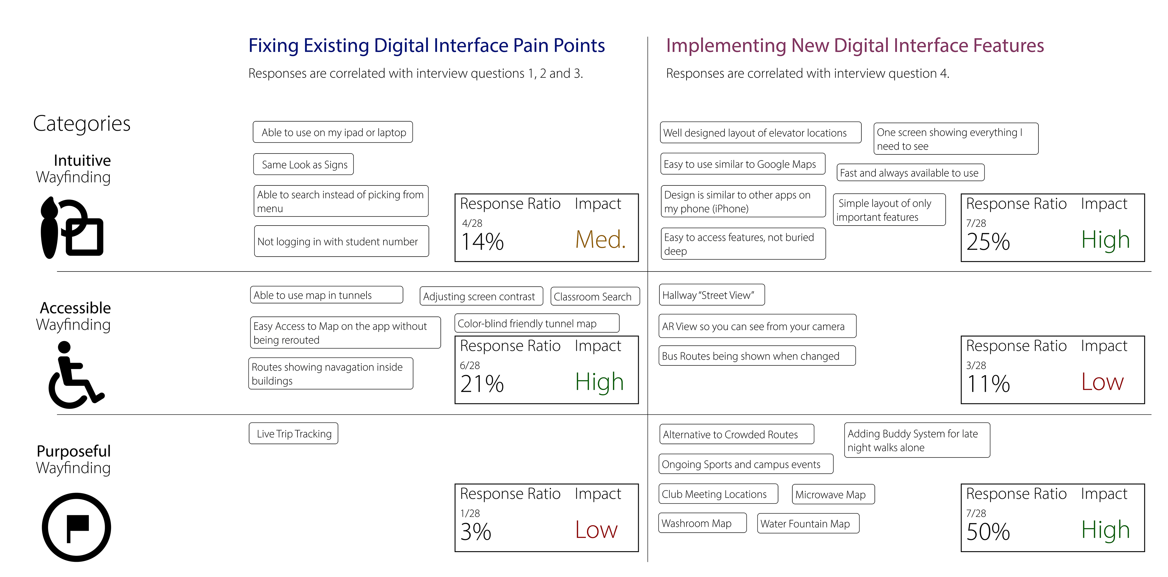
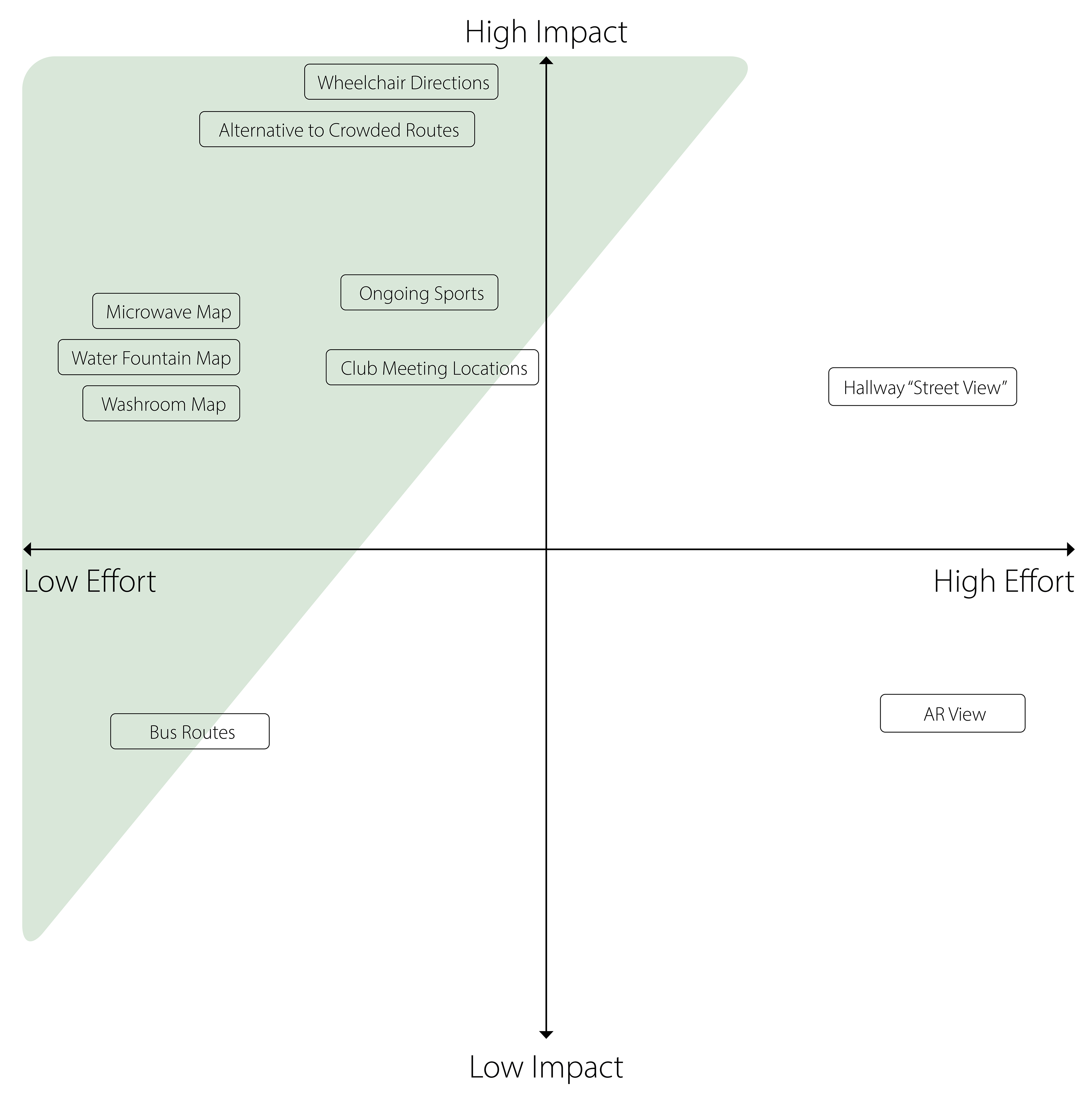
Fixing Existing Pain Points
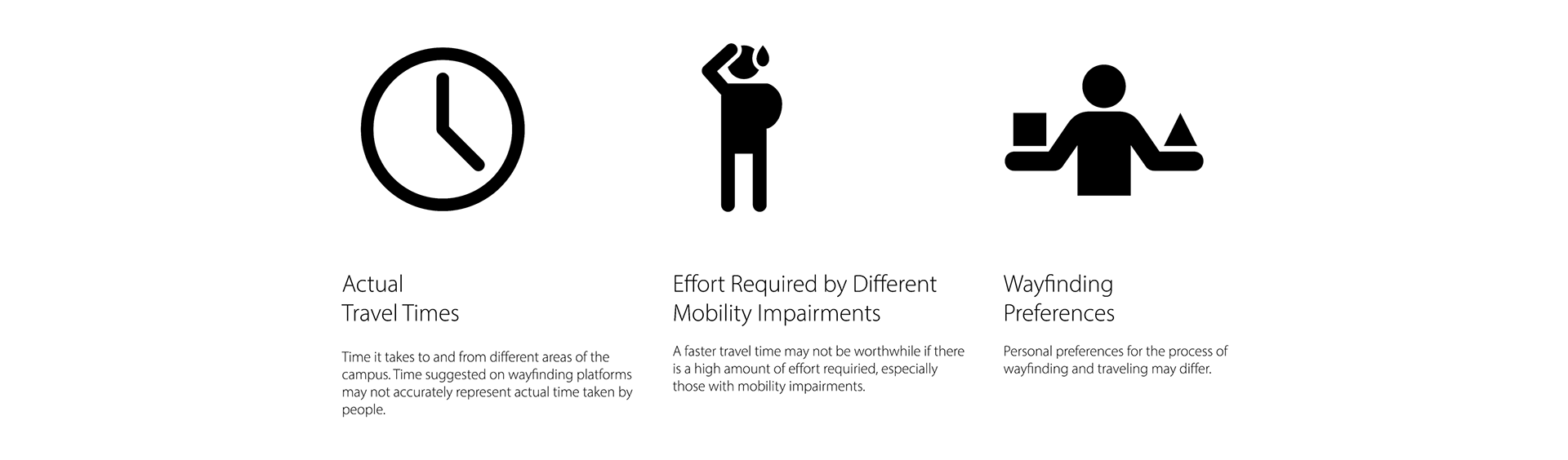
Content analysis was used to determine placement on the impact axis and personal justification was used to determine placement on the effort axis. Consideration is mainly given to goals that can be tangible to attain and has a good value for the general student population or high value for individuals who will greatly benefit from it.
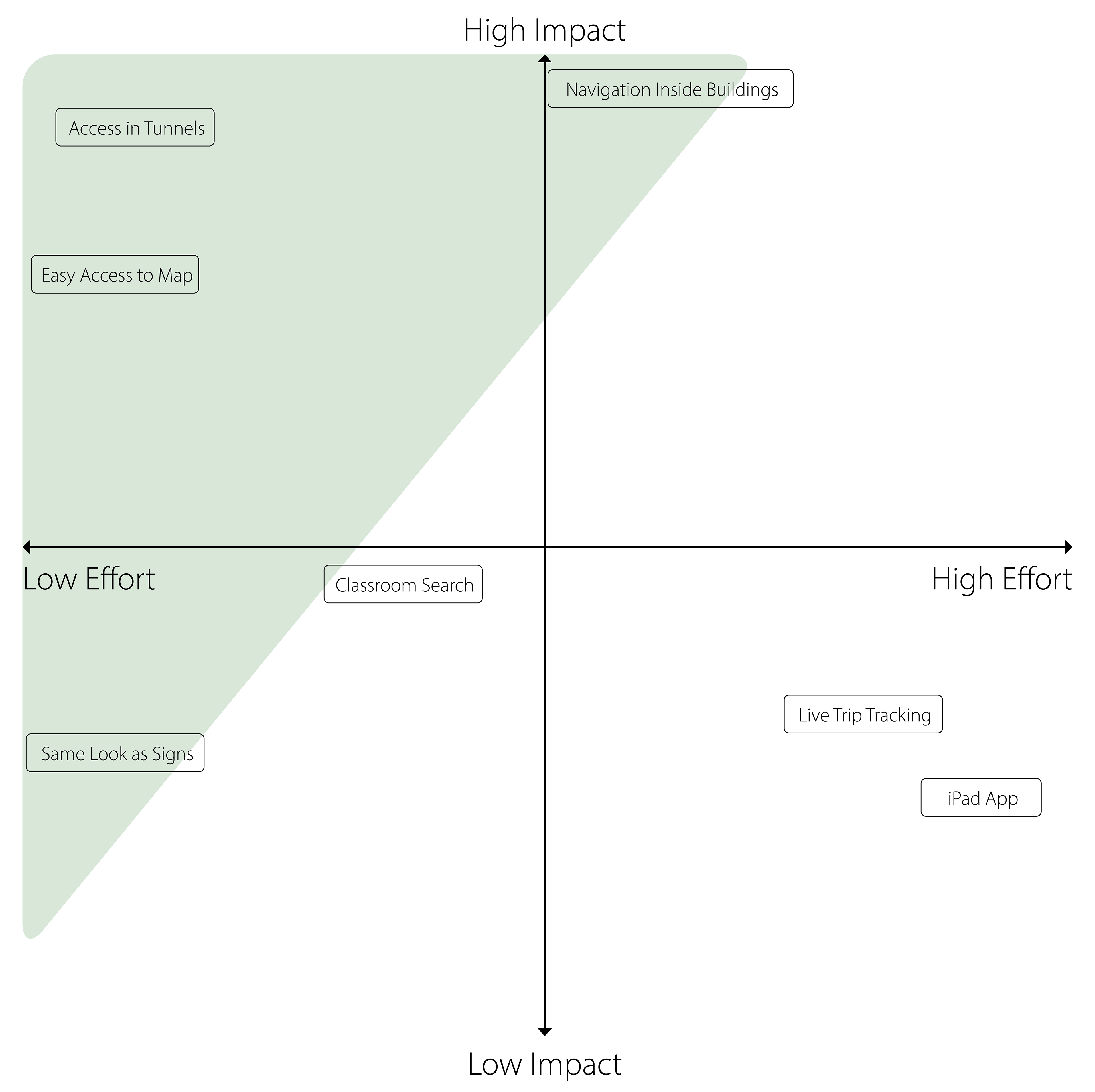
Selected Features for Fixing Existing Pain Points
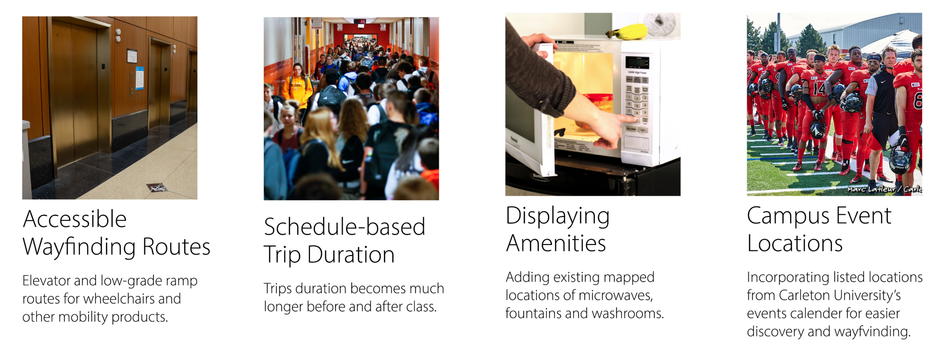
Implementing New Features
The same type of content analysis was used to determine placement on this impact-effort matrix.
Selected Features for Implementing New Features
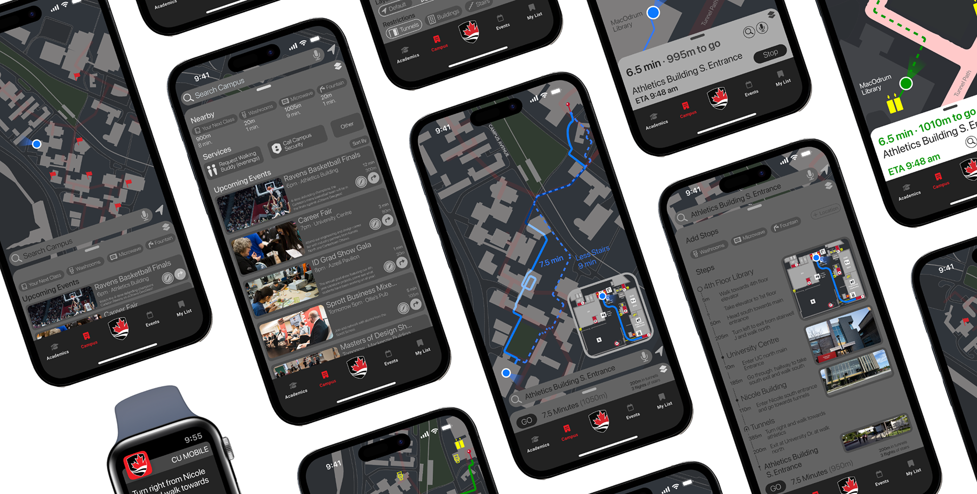
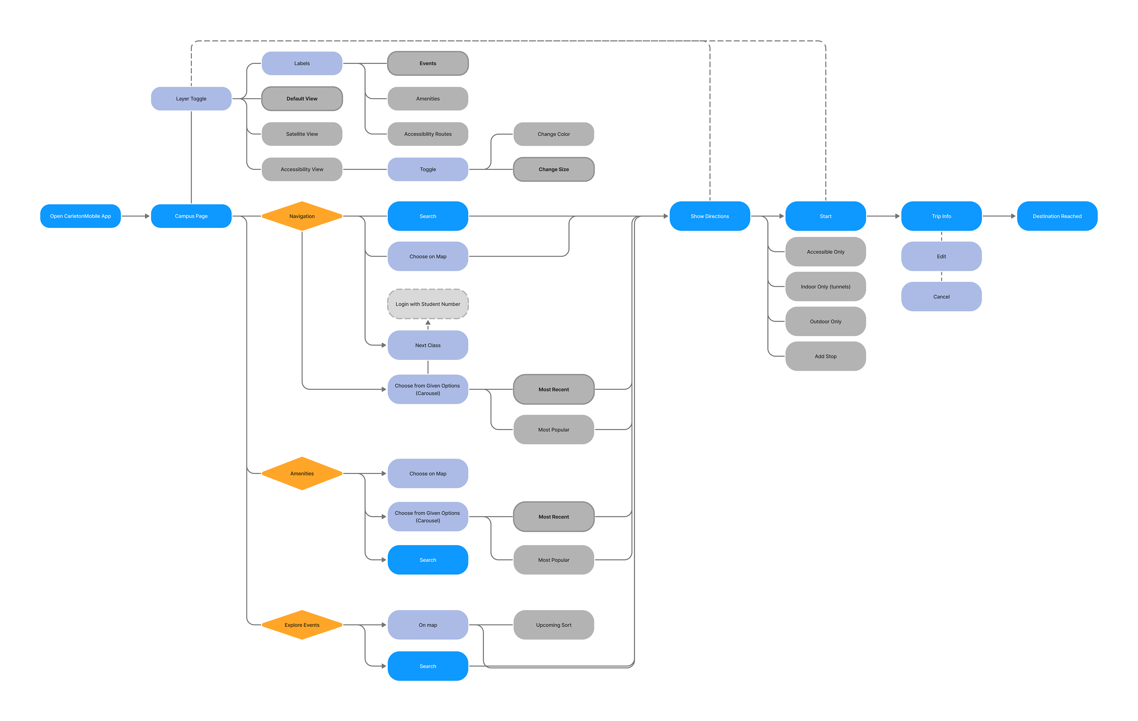
User Flow Through Implementing High-Impact Features.
3 main uses for a campus-only map were identified, and main user journeys are based on it. Secondary UX features allow for the selection of different options to cater to the respective screen. Consideration was also made for accessibility when it comes to UI design and
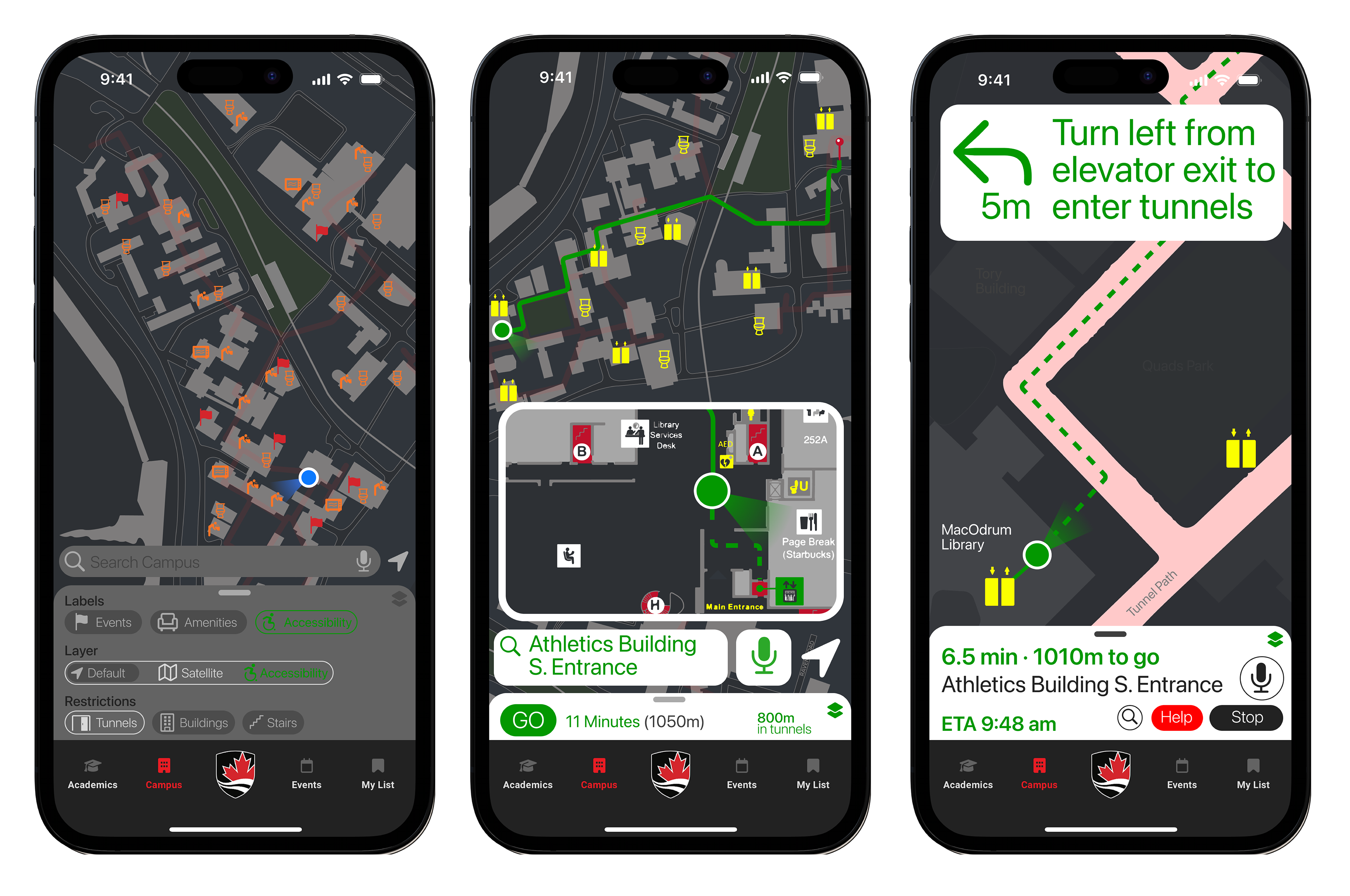
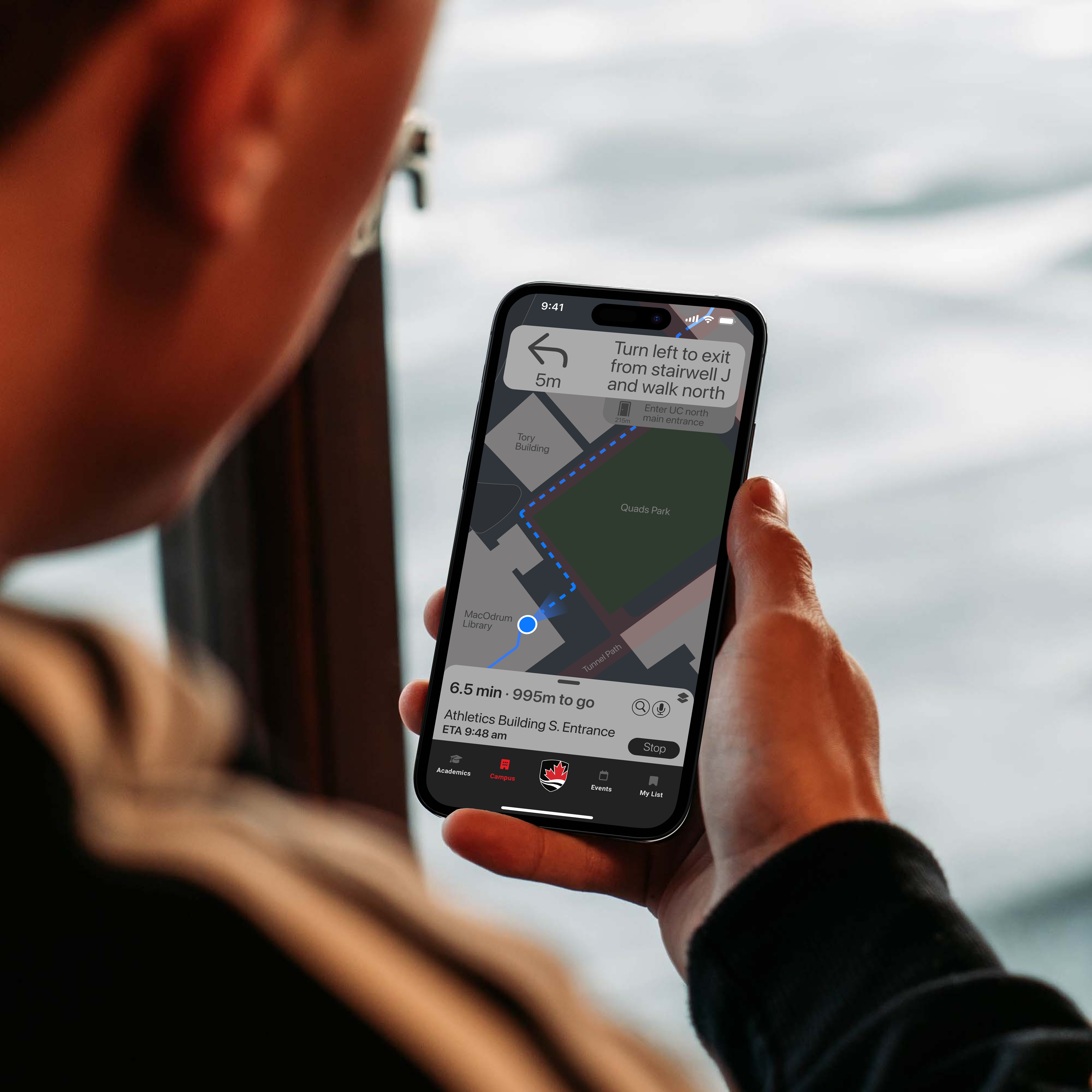
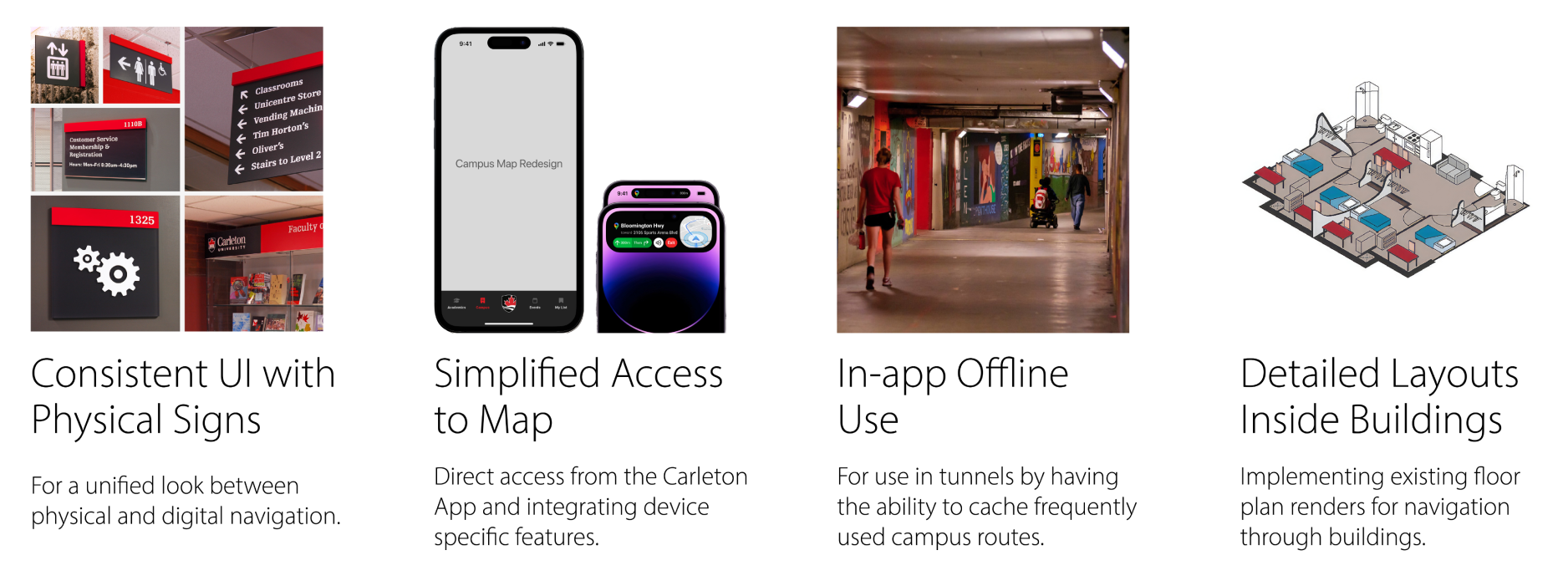
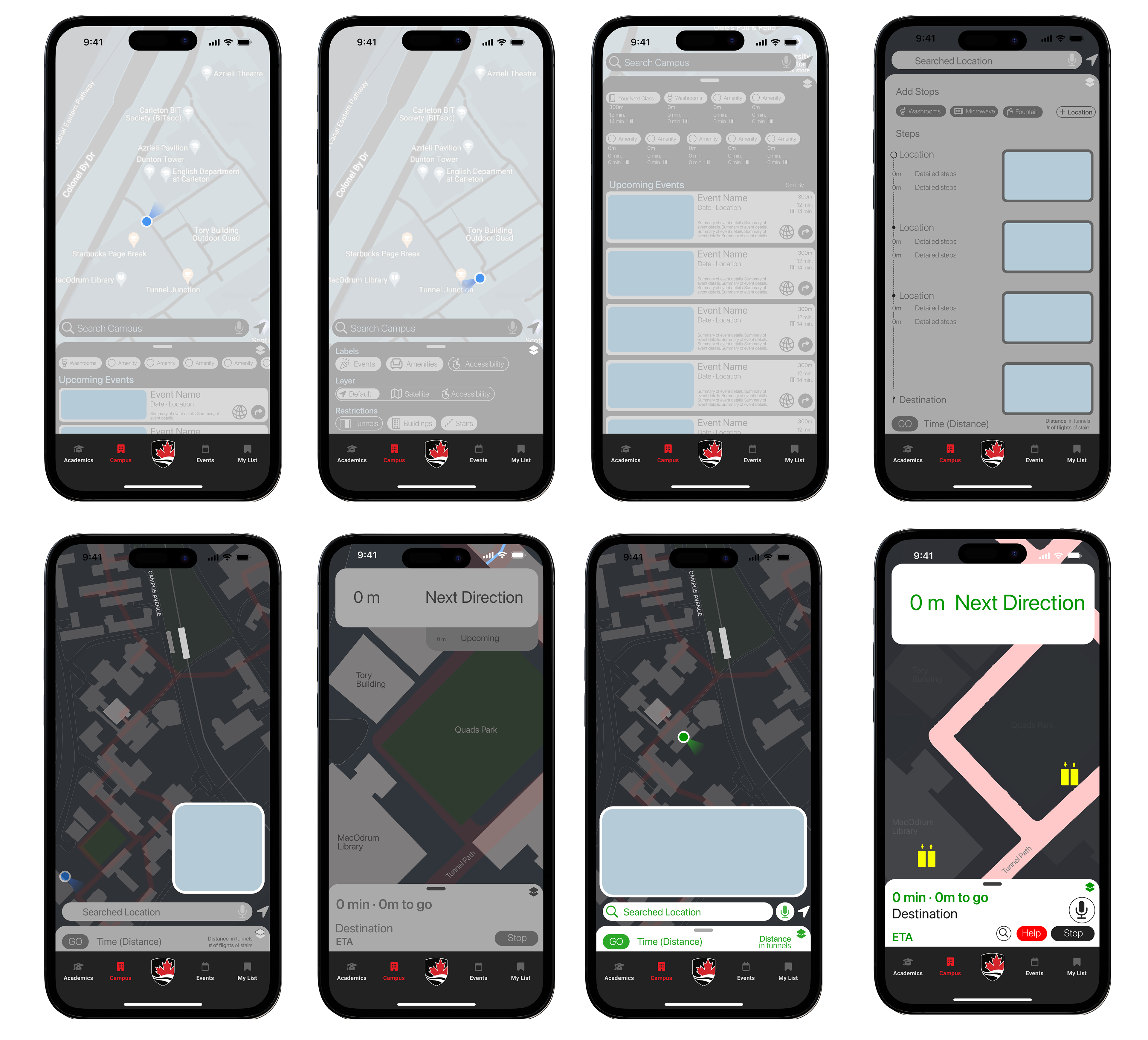
Screen Mockups from Existing CarletonMobile App UI.
Based on the user flow, respective mockups were made for the main user journeys and how each feature is laid out. While the campus map section was redesigned, the toolbar and other elements remained intact.
Designing an Intuitive Wayfinding Experience
Feedback on new features grouped during content analysis led to redesigning the core user interface to make it seem easy to use with important features upfront. The campus map is displayed with labels for ongoing events. A pull-up tray reveals nearby amenities, safety services, and list of upcoming events.
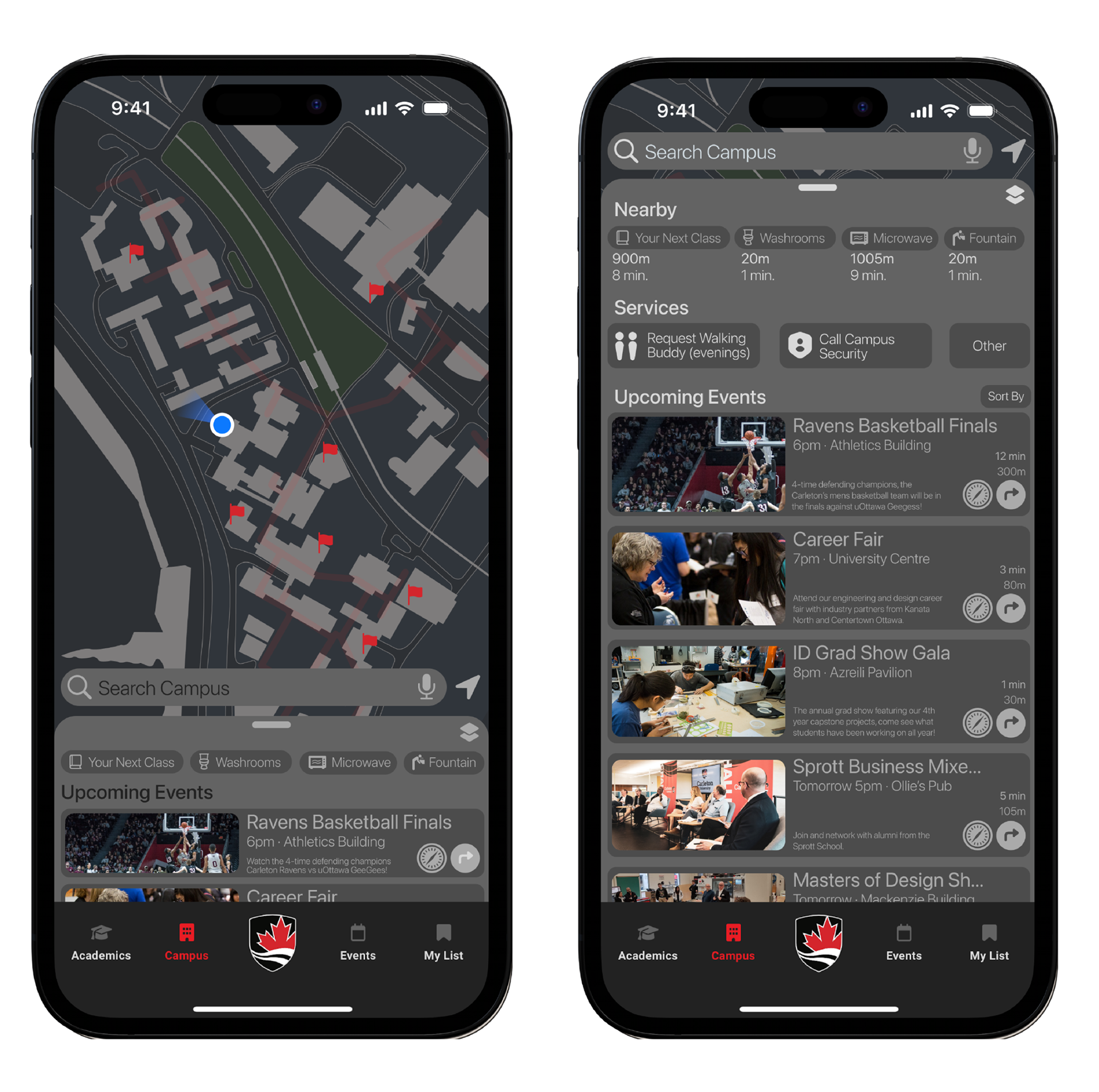
Purposeful CarletonU Features Not in 3rd Party Apps
Users will not want to download and/or use another app than the one they commonly use, which is why implementing purposeful wayfinding features specific to CarletonU is important for sustained use such as a similar UI to popular apps, detailed interior views, and step-by-step navigation with pictures.
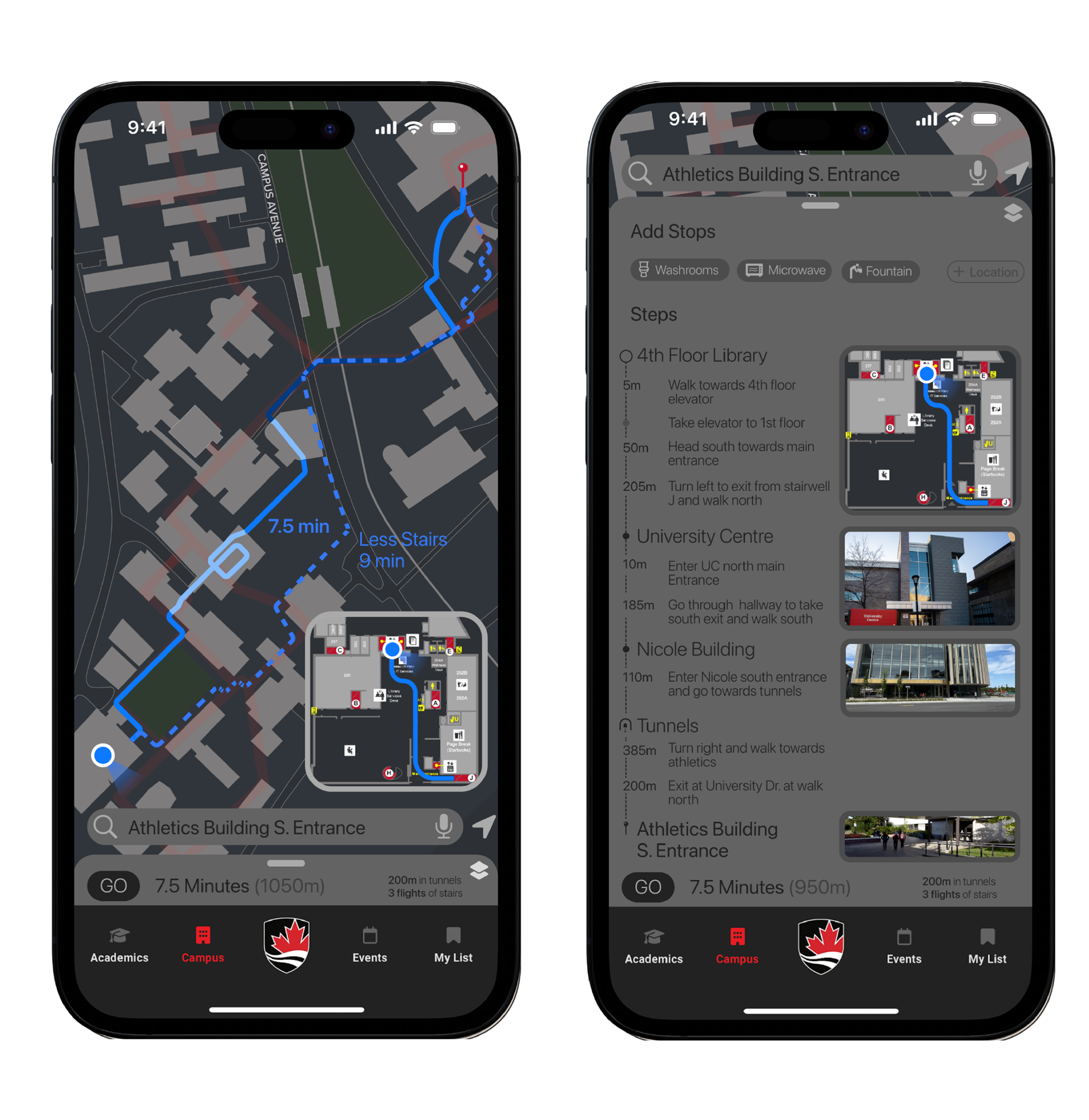
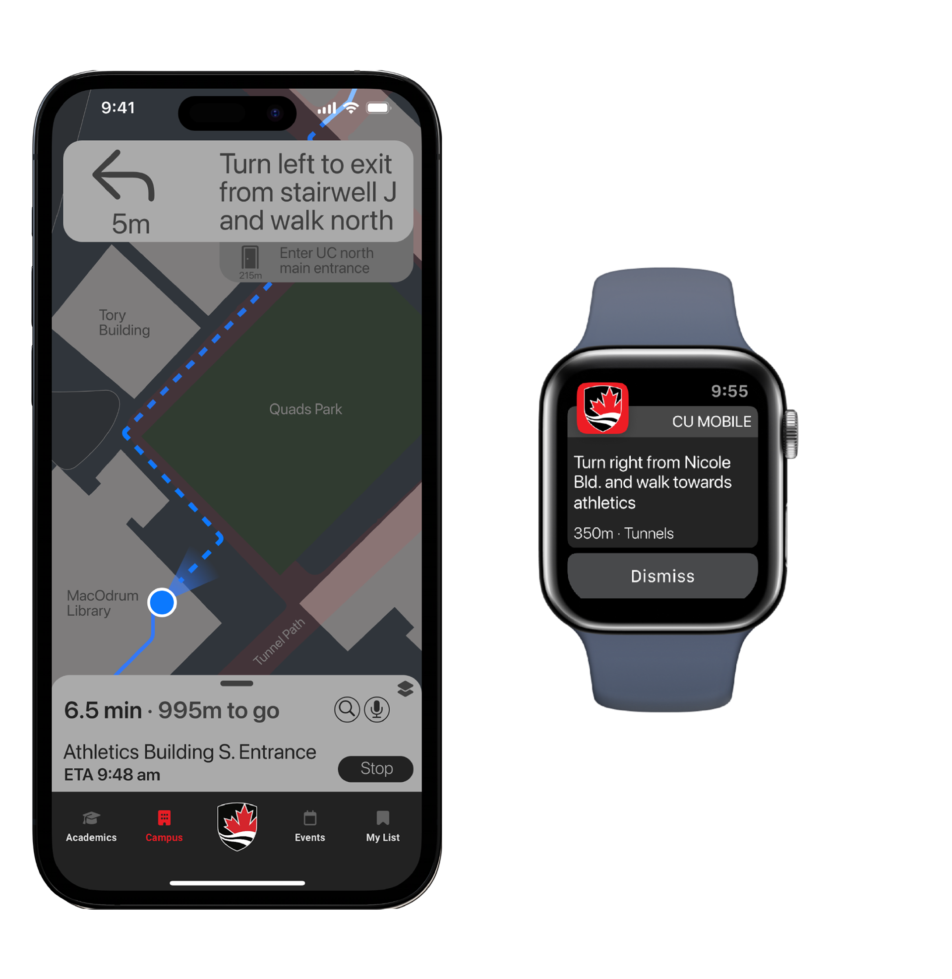
Making Features for the Mobility Impaired Useful to All Users
Features for wayfinding using a wheelchair or with sensory impairments are not exclusively useful to those individuals but all users who can benefit from these additional accessibility options. Higher contrast, larger font sizes, and enlarged UI elements are presented on respective screens to help users with both sensory and mobility impairments.